AI Data Analytics Has a UX Problem (Part 1)
There are serious problems trying to do data analytics through a text box.

Greetings friends,
In this issue of How To Speak Data:
The UX Of Data Analytics Is Wrong (Part 1).
Details about Chart Chat #72: Show and Tell. We’re going to share and decompose some recent data storytelling work. Please do sign up and join us live on July 23rd at 11am ET.
I have turned on payments for this newsletter. If you’re willing and able to support me in producing this newsletter, I’d be very grateful.
In November 2022, OpenAI decided, as a research experiment, to stick a text box on top of its LLM, call it ChatGPT, and make it publicly available. It became the fastest-growing app ever. The rest of the tech world reacted and we all decided that, in order to interact with an LLM, you just needed a single-threaded text box chat interface.
In the data analytics world, everyone copied it. At Tableau, we raced to build a “Copilot”. PowerBI did the same. Everybody did the same.
Right from the start, this felt like the wrong way to do AI analytics. In January 2024, I gave a presentation to Tableau’s engineering team about my concerns.
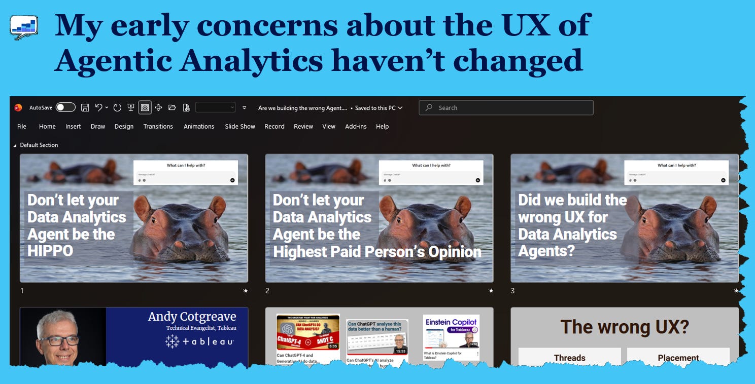
Now, in July 2026, the same UX problems persist: data gets simultanously oversimplified and the interface gets harder to use.
Let’s take a deeper look. In my next newsletter, I’ll share solutions.
The problems
1. Conversations with data are not linear
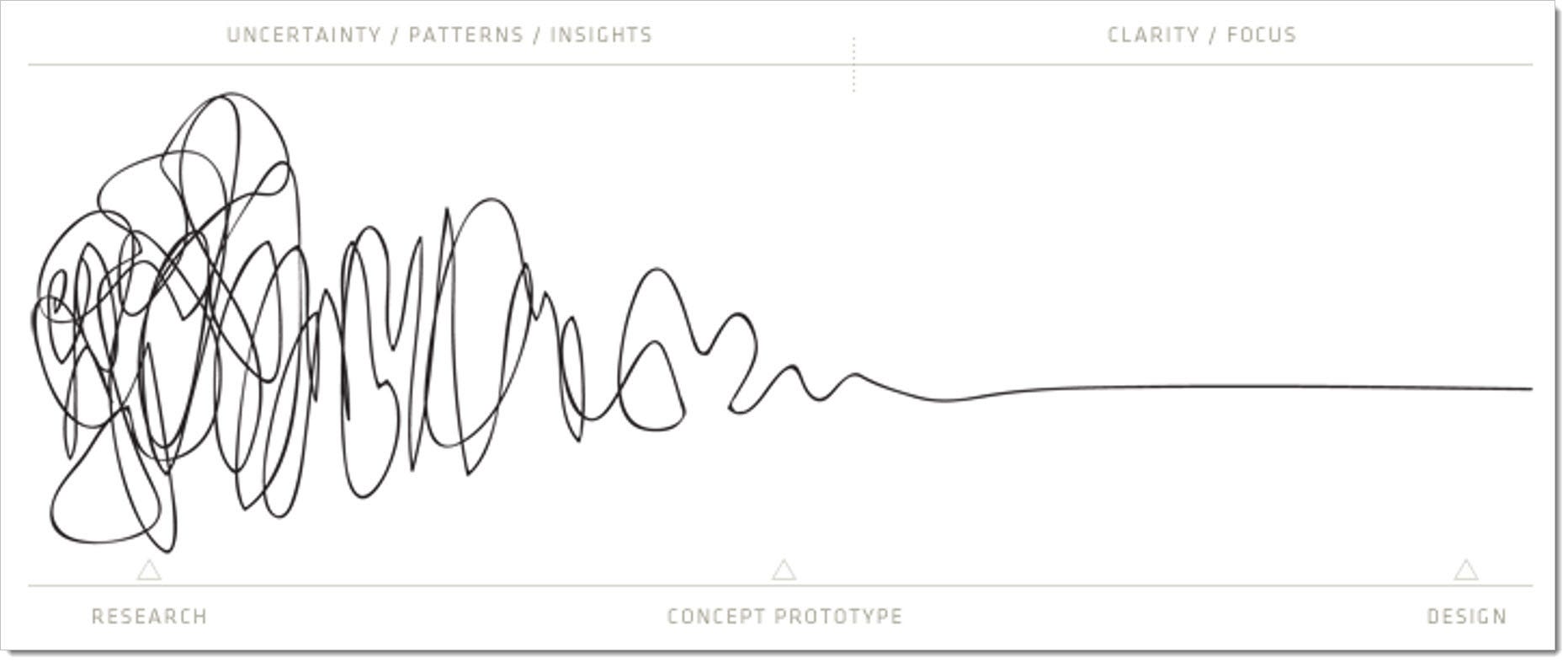
Verbal conversations are linear. Conversations with data are not.
It’s 11 years since I wrote about the Squiggle of Visual Analysis. tl/dr: data exploration is the ability to jump back and forth, up and down, in and out as you seek the best articulation of the data.
Have you ever explored data in ChatGPT, Claude, or Gemini, and got frustrated because you’ve had to scroll back up the page to find an earlier interaction? That’s the manifestation of this problem.
Single-threaded data analytics in a text box is not the squiggle. Scrolling up and down in a chat interface and trying to refer back to an earlier moment is annoying and inefficient.
2. Single-threads give you one answer at a time
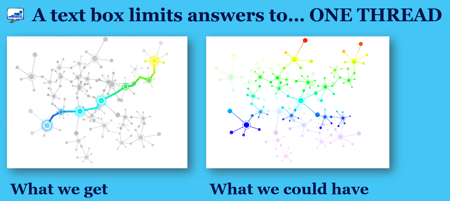
A single thread in conversations with LLMs are fine if you’re just shooting the breeze. Surely this is limiting? An LLM could provide infinite answers to any questions you ask. How many useful insights do you miss because the LLM only gives you one?
When I’m in a room with lots of humans, each of them bring their own characteristics and biases to a data related question; many might be surprising and useful. I want that in my analytics too: it’s the squiggle in action, in AI analytics.
3. Don’t make me move my eyes!
One of the best things about working about Tableau was that it was built to exploit the power of our cognitive system. The goal was to keep users’ eyes where the action was. This avoids “change blindness.” What is that? Watch the video below: can you spot the difference in the two images?
It’s hard to see because of the “flash” of grey between the two images. That’s all it takes to flush your brain’s memory cache of what it just saw. Amazing, right?
The same happens if you move you eye from one part of a screen to another. This is why we always tried to keep your eye on the action in Tableau.
The problem with side-bar AI conversations is that your eye is always moving and missing the action. For example, imagine you want to change something using the Copilot in PowerBI. The red line in the image below traces what your eyes might do:
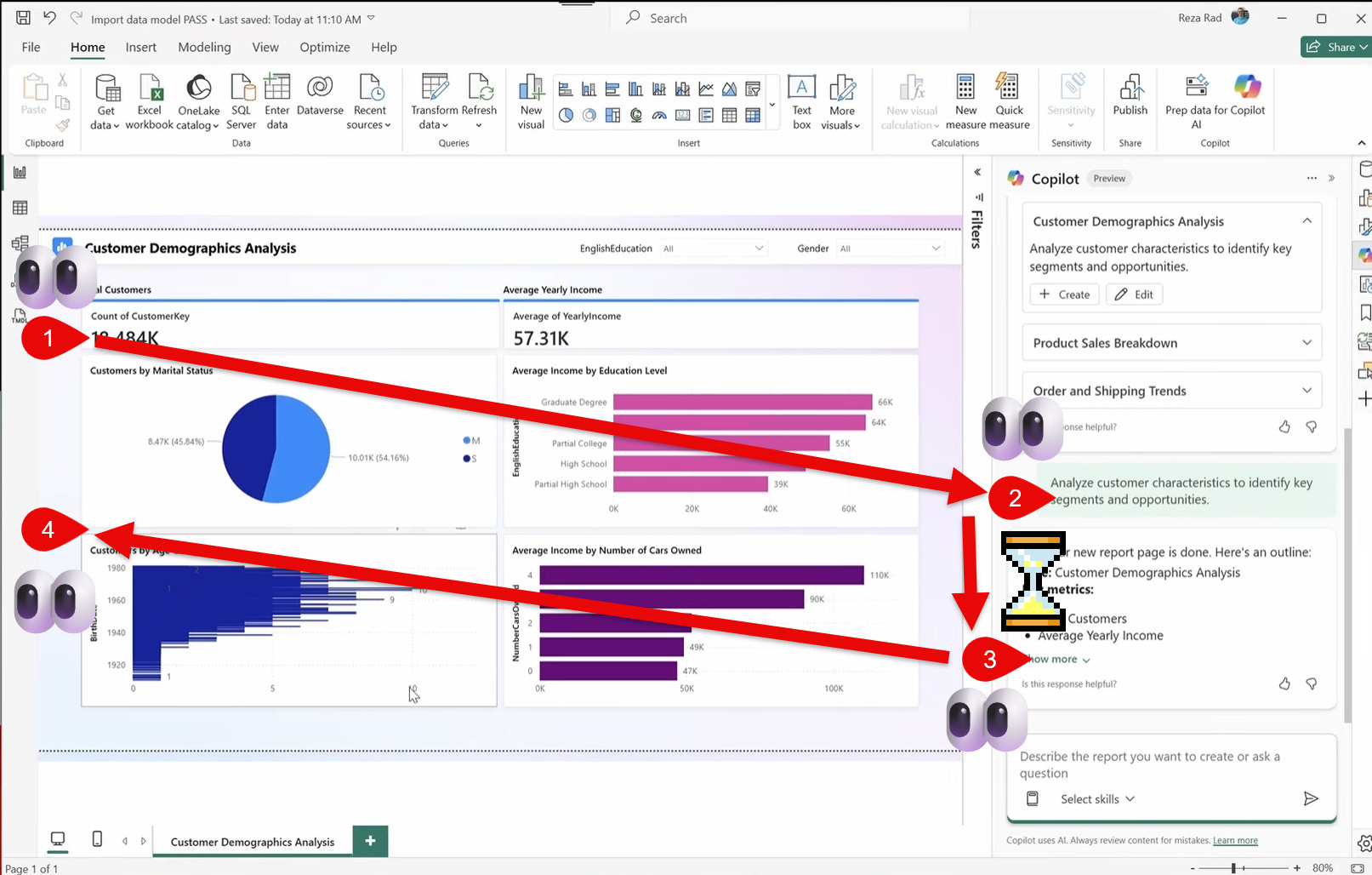
You’re looking at data... then you type a question (no longer looking at data).... then you wait a while (do you go look at your phone for a moment?)… and finally you go back to the data display. What changed? Who knows, because you’re weren’t looking there.
4. Data gets squished in conversation panes
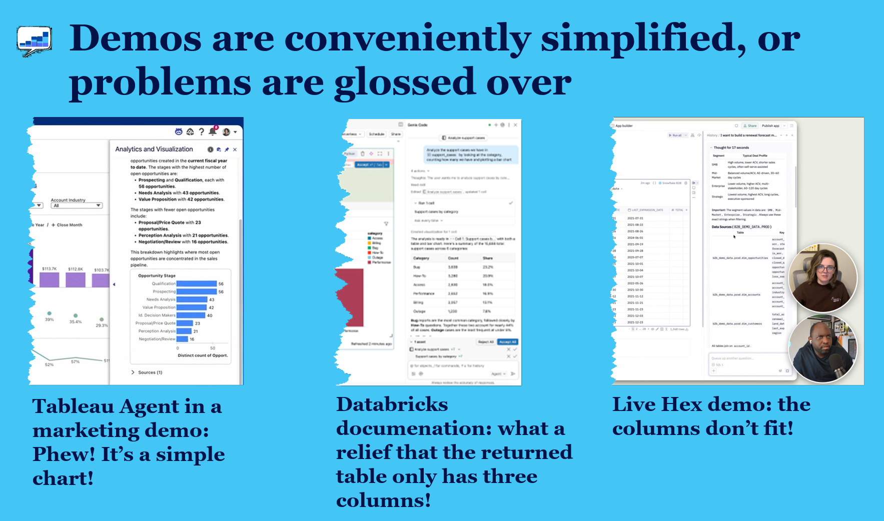
While the first three problems are about how the analysis gets done, this last one is about how it gets presented.
A lot of apps use conversational panes at the side of a main data canvas. This seems logical: “Let’s build the app so the datas in the main view and the conversation to the side,” seems like a reasonable product direction.
The glitzy demos say “As you converse with the data, you get charts inline showing you the details.” Two things tend to happen in these demos. Either
the resulting chart is unrealistically simple
the resulting chart is unreadable and the demo moves on very quickly
Real world charts get complex quickly and there simply isn’t enough screen real estate in these panes to show the detail. If we actually expect users to consume the information in those panes, we need to fix the display.
What do we do about this?
What do you think? Are there other UX problems with the current approach to AI data analytics?
I proposed ideas to the development team about ways to minimize the problems. Two years later, I’m seeing a lot of vendors implement various novel ideas, too.
I’ll explore all of those in part 2.
Chart Chat: show and tell my latest project

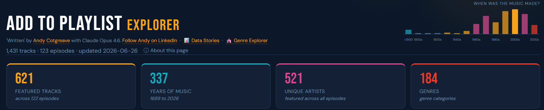
It’s Chart Chat 72 on July 23rd. We’re all going to share some recent projects, along with the highs and lows of each. I’ll be sharing my Add To Playlist explorer (a work in progress you can see here).